
A building contractor is relaunching his business after ten years under the same name, but his quotes go out with a pixelated logo taken from a free generator in 2015. His prospects associate this blurry visual with a lack of seriousness. Creating a custom logo, in this specific case, is not just a matter of graphic vanity: it is a direct lever on the conversion rate of contact requests.
Specifications for the custom logo: what blocks progress before design
It is often thought that creating a logo starts with choosing colors or typography. In practice, the first obstacle lies elsewhere: the majority of briefs sent to graphic designers remain too vague. “Something modern and professional” does not provide anything usable.
A useful specification describes the actual context of use for the logo. Where will it be seen first: on a utility vehicle, a Google Business listing, a rubber stamp, an Instagram story? A logo designed for a dark website background does not necessarily work when embroidered on a light polo.
The brief should also list the physical and digital media already in circulation. If the company uses PDF quotes, signage, social media profiles, and business cards, the logo will need to exist in several variations (monochrome, compact version, horizontal version). Ignoring this constraint forces a redo of the work a few months later.
To explore design approaches suitable for small structures, one can consult the page https://maisonlogo.fr/ which details several custom creation formulas.
Color and typography choices: arbitrate based on use, not preferences
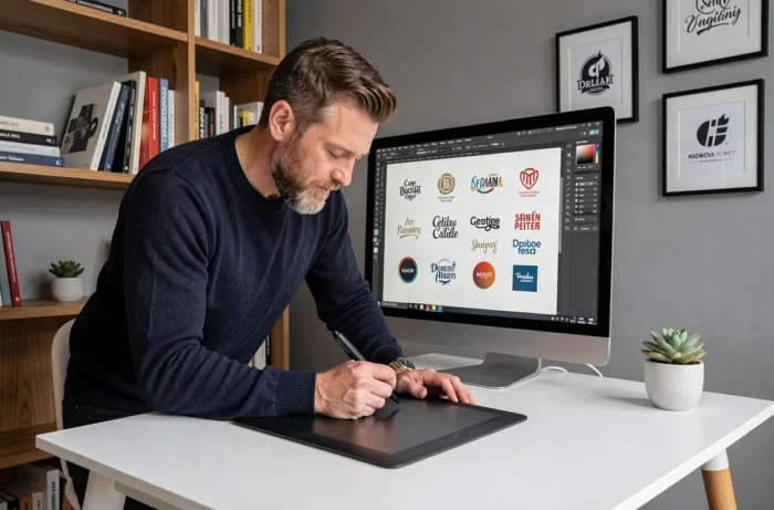
The colors of a company logo should not be chosen on a whim. They should first be tested in real display conditions. A stunning royal blue on a Retina screen can turn dull on a low-quality four-color printed sign.
Limiting the palette to two or three colors reduces the risks of inconsistent rendering across media. It is observed that the most readable logos on social media (profile thumbnails, avatars) work with a strong contrast between the background and the main motif.
Regarding typography, the trend towards simplification is confirmed in professional logo design. Sans-serif fonts dominate because they remain readable at very small sizes, especially on mobile. Feedback varies on this point: some sectors (luxury, high-end craftsmanship) still benefit from serif fonts, provided the body text remains thick enough.
Graphic elements to test before validation
- The logo reduced to 16 x 16 pixels (favicon): does the symbol remain identifiable or does it become a color blot?
- The logo in pure black and white, without shades of gray: if the shape disappears, the design relies too much on color.
- The logo on a busy photographic background (website banner, social media cover): is the contrast sufficient without adding a white border?
These three checks take five minutes and prevent discovering a visual identity problem after printing several hundred media.
Legal protection of the logo: what changes with the European reform of 2026
A custom logo represents an investment. Protecting it legally is not optional, especially when a competitor in the same geographic area could freely draw inspiration from an unregistered visual.
Since July 1, 2026, the Regulation (EU) 2026/715 has modified the rules for filing designs and models with the EUIPO. Companies that use an animated logo (video intro, loading animation on a website) can now file a representation in MP4 video or 3D (OBJ, STL formats). The number of views accepted for the same design has increased from 7 to 10, making it easier to protect variations across different media.

The other concrete change concerns logos used as icons, digital interfaces, or avatars. These elements are now protected as “non-physical products” under European design law. For a company that adapts its logo into an augmented reality filter or a mobile app pictogram, this extension changes the game.
The 2026 EUIPO examination guidelines also strengthen the scrutiny of evidence to be provided during filing. A logo that is too generic, composed solely of basic geometric shapes, is more likely to be rejected. Betting on an original design from the outset reduces the risk of rejection at filing.
Consistent visual identity across all communication media
A logo alone does not build a brand image. It is its consistent variation across all media that creates recognition: email signature, invoice header, social media profiles, packaging, signage.
When delivering a custom logo to a company, the minimum deliverable should include:
- Vector files (SVG, AI, or EPS) for printing without loss of quality, regardless of size.
- PNG versions with a transparent background in several resolutions (for web and social media).
- A simplified graphic charter specifying the exact color codes (Pantone, CMYK, RGB, hexadecimal), the protection zones around the logo, and prohibited uses (deformation, free recoloring).
- A monochrome version and an inverted version (light logo on a dark background).
Without this foundation, each new printed or digital media leads to a different interpretation. Within a few months, the visual identity fragments and loses impact with clients.
The most revealing test: display side by side the company’s LinkedIn page, its website, its latest sales brochure, and a recent quote. If the four do not seem to come from the same structure, the problem does not lie with the logo itself but with the absence of variation rules.
A well-designed and properly protected custom logo remains usable for a decade or more. The condition is to treat creation not as a one-time expense, but as the first brick of a complete visual system that accompanies every point of contact with your clients.